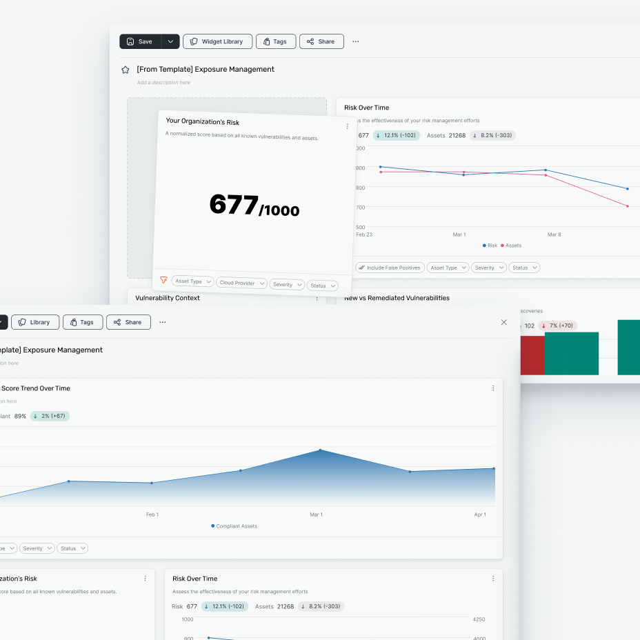
Visual Language for Data-Heavy Cybersecurity Products
| Date | 2024–2026 |
| Role | UX/UI Designer |
| Tags | Visual Design Data Visualisation Dashboards Reporting Cybersecurity |
A UX and visual overhaul for data-heavy cybersecurity dashboards and reporting experiences. The work redefined how dashboards were structured, how they supported decision-making, and how they could evolve into reports, while introducing the Atlas look and feel as an early expression of a more unified platform.
- Reworked dashboard and reporting experiences across data-heavy cybersecurity workflows.
- Helped define how dashboards could move from live product views into more structured report experiences.
- Developed the Atlas look and feel as an elevated visual direction for the platform.
- Improved hierarchy, spacing, density, contrast, chart presentation and layout structure.
- Created a more unified foundation for dashboards, reports, tables, cards and data visualisation patterns.
Cybersecurity products are dense by nature. Users need to understand risk, identify patterns, compare changes over time and move quickly from insight to action. Across dashboards and reporting, the challenge was not only to improve how data looked, but to rethink how these experiences were built, used and connected across the platform.
The challenge
Dashboards and reports sit at the centre of many cybersecurity workflows. They need to summarise activity, surface risk, show trends and help users understand what needs attention. They also need to serve different modes of use: live monitoring, investigation, comparison, stakeholder reporting and decision-making.
Before this work, dashboard and reporting experiences risked feeling too disconnected. Similar problems were being solved in different ways, and visual inconsistency made dense information harder to scan. The opportunity was to create a clearer model for how dashboards should function, how reporting should build on that experience, and how both could feel like part of the same platform.
Dashboard to report experience
A key part of the work was looking at the relationship between dashboards and reports. Dashboards were not just static collections of charts. They needed to help users understand what was happening in the product, then support a natural path into more structured reporting.
This meant thinking about dashboards as part of a wider experience: how data is grouped, how key metrics are introduced, how charts support comparison, how supporting detail is revealed, and how users move from a high-level view into something more shareable, reviewable or report-like.
The goal was to make the transition from dashboard to report feel more intentional, rather than treating them as separate surfaces with different rules.
Atlas look and feel
This work was also one of the first experiences to receive the Atlas treatment: a more elevated look and feel that brought clarity, polish and stronger visual unity to the platform.
Atlas helped define how Rapid7 products could use depth, colour, typography, density and visual emphasis to create interfaces that felt more modern and easier to read. It was not just a cosmetic refresh. It gave the platform a clearer visual direction and helped show what a more unified Rapid7 product experience could feel like in practice.
For dashboards and reporting, Atlas created a calmer foundation for dense information. It helped key metrics stand out, gave charts and cards a more consistent structure, and made complex data surfaces feel more deliberate and easier to scan.
Visual language and data presentation
The overhaul focused on both visual craft and product clarity. That included hierarchy, spacing, contrast, typography, chart treatment, card structure, layout rhythm and the relationship between key metrics and supporting context.
The aim was to make complex information easier to compare and act on. Important data needed to be visible without overwhelming the page. Secondary information needed to support understanding without competing for attention. Dense layouts needed enough structure to remain readable across different product scenarios.
Platform unification
The work looked beyond individual screens. Dashboards, reports, tables, cards and data visualisation patterns needed to feel like part of the same system.
By aligning these surfaces around shared visual and UX principles, the platform gained a stronger foundation for presenting data-heavy experiences consistently. This was one of the first moments where the product began to feel less like a collection of separate areas and more like a unified platform with a recognisable interface language.
Outcome
The result was a clearer and more scalable approach to dashboards, reporting and data-heavy UI. The work improved how complex information was structured, how users moved between dashboard and report modes, and how visual language could support clarity across dense cybersecurity workflows.
Atlas gave the experience a more polished and unified platform direction, helping teams see how product quality, data visualisation and system consistency could come together in practice.
Reflection
This work reinforced that visual design in complex products is not decoration. In cybersecurity workflows, UI craft directly affects how quickly users can scan, compare, understand and act.
The strongest visual language is not the loudest one. It is the one that makes complexity feel manageable, creates confidence in the data and helps separate product surfaces feel like part of the same platform.
Some project details are kept private due to the nature of cybersecurity work. Reach out if you'd like to discuss the process in more detail.